Bon Voyage
How might we design a better travel experience for an underserved audience in the travel industry?
Brief
Find an underserved travel niche and design a mobile app that provides information and recommendations about where people can go and what to see in different cities around the world.
Solution
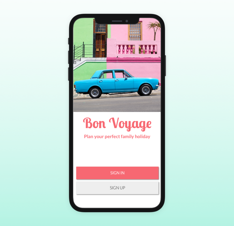
Bon Voyage is designed for single parents who travel with kids to help them plan their holiday, have great time with their children as well as enable them to have time for themselves while the kids are looked after.
My role
Individual project. 6 weekly sprints. I conducted domain and user research, created visual design, received peer feedback and tested the prototype with users to iterate and produce a final solution.
Tools: Sketch, marvel, inVision
1. Identifying the problem
Domain research
Travel is no longer a luxury and has become a normal part of life. Family travel is a big part of the industry. But it’s no longer enough to pitch products to this broad market category. New subsets of the family niches like gay/lesbian families, single parents, multi-cultural families are underserved.
The fastest growing segment among these are single parents with kids. The majority of them are single mothers aged 35 and older, who are educated and financially stable single parents by choice.
User interviews
Having found this growing and promising subsegment, I have decided to talk to parents.
But I had to be pragmatic and broaden my scope of user research due to time constraints. So I decided to also try to find parents who raise children with a spouse or a partner, but have experience solo-traveling with kids.
I spoke to 4 people. Although one of them was a dad who traveled as a solo parent with his son once, he had similar pain points as other three women I talked with.
I created a user persona of Fiona based on the common pain points my users mentioned.
2. Framing the problem
Fiona has many needs. To narrow down the problem and prioritise only MVP features I first tried to come up with ideas by myself. I tried to empathise with my user by creating user stories:
As a single parent, I want to easily find kids-friendly options for accommodation, food and activities, so everyone is comfortable during the trip.
As a busy professional, I want to be able to quickly find and book appropriate attractions and generate itinerary so that I spend less time planning on the go.
As an experienced traveler, I want to have plenty of travel options to choose from so that I have a more authentic local experience.
Initially I came up with this problem statement:
A busy single parent needs a one-stop-shop to plan family holidays because traveling with kids often requires specific preparations and somewhat restricts available options.
3. Ideation and refining the problem
A few quick 6-8-5 sketches helped me to imagine a flow. Discussing these with 4 parents gave me some unexpected insights.
Parents were particularly interested in seeing that a hotel has amenities for kids, saying it could influence their decision. Traveling with kids means watching them 24/7, and it’s easier if the hotel is child-friendly.
Yet they often want to go out for a drink somewhere alone, but can’t as there is usually no babysitter service quickly available. So they can only order room service and stay in the room, which is not fun.
This unexpected insight revealed a deeper issue. I saw that their main challenge was to be able to do both: enjoy time with their kids and also have some time for themselves.
Refined problem statement
A single parent traveling with kids needs an easy way to find kid-friendly options as well as childcare on the go, so everyone - an adult and kids - can have their fun and relaxing times during the holidays.
User flow
After refining the problem I created a diagram to illustrate my anticipation of a simple cognitive flow a parent would take while using Bon Voyage. It would help me to stay focused on creating and testing essential features first.
4. Visual design
To make sure the product has good market fit, I looked at the colour palette, typography, iconography, and visual language of top five competitors.
I wanted to stand out from the competition and produce a fresh look. I started with creating mood boards and then synthesised my ideas into style tiles.
Mood boards
Style tiles
Friendly & Colourful
Fresh & Energetic
Taking feedback onboard
We had regular design critiques with peers and the lead designer, and during these sessions I showed my moodboards and the style tiles for review.
The Fresh & Energetic moodboard did not get across the message I’d chosen for Bon Voyage, while the typography and icons from the Friendly & Colourful style tile was perceived a bit too childish.
At this point I had to detach myself from the styles I created and take the critique onboard.
I really listened to what worked and what didn’t and created a new style from scratch.
5. Evolution of key screens
1. Onboarding and family profile.
Creating a profile for each family member perceived as unnecessary and exhausting for users, so I switched to choosing kids ages when signing up. When tested, there were too many options, so I simplified the screen.
2. Discovering available options.
The map feature didn’t make sense to users, so I changed it to “Change dates” to for quick correction of their chosen dates.
I also put Accommodation section on top as it was the first thing users would be sorting.
3. Accommodation details.
This screen had several changes. Users weren’t that interested in seeing reviews in great details, so I removed this section.
I added the Childcare services. Users I spoke to said that this will certainly help them to decide on a hotel, so I illustrated this feature up high. These images for childcare services are clickable.
4. Night nanny details. At first I chose the same UI elements for the calendar and the time that I used on other screens to ensure consistency.
But my users didn’t like this at all. They were confused why they needed to choose the dates again if the hotel knows their period of stay and the nanny is provided by the hotel.
They were also wondering how it will work if they needed a service for different dates and times.
So I created new UI elements for this screen, where they can immediately see the timetable of a particular nanny and also be quick and flexible when choosing different options.
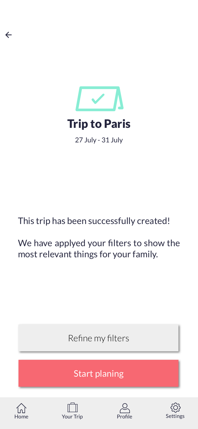
Final Hi-Fidelity screens
Reflections
Importance of feedback: This was my first project with UI and also the first one where I had to show my design to peers and users. I had to separate myself from my design in order to move forward and create solutions that would resonate with users. Listening and taking notes helped a lot, because I would re-visit the feedback and analyse it several times to understand the directions I need to take.
Narrowing down the scope: The initial brief was open to a wide interpretation. And although I though that I narrowed it down to one particular segment of users, I also needed to narrow down the problems users have. In my case, single parent don’t just need kids-friendly accommodations and attractions, but they also need time for themselves. This insight came from talking to people and listening to their stories, not just but asking direct questions. Once I dived really deep into their experiences, I was able to propose a solution for that most important issue.
UI is not just colours: UI is essential part of the UX design, but creating the right mood and beautiful typography and iconography is not enough. I had to change visual elements because they didn’t make sense to users. There are dozens of UI templates for time and date, but they don’t necessarily fit a particular use case. I learned that a designer need to do their best to see through the eyes of a user.
Other projects
Islington Council
Personalised portal to use council services.
London public library
Library as a community hub.
Tutti.space
Native app for creative people.


