London Public Library
How might we help library engage more visitors in library events and increase its profile as a community hub?
Brief
The library was falling behind with integrating technology into its structure and wanted to find technological solutions to strengthen its relationships with the community it serves.
Solution
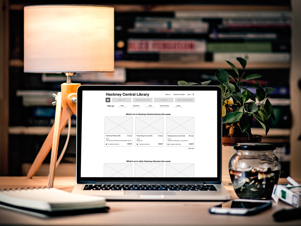
We proposed improvements for both online and offline experience in the library. Our digital solution focused on clarifying the services the library has to offer and a streamline process of signing up for them.
Tools: Trello, Otter, Mural, Sketch, Axure
Team and my role
6 weekly sprints. 4 UX Designers. My contribution:
SME interviews and contextual enquiries
Drafting a user journey
Designing event description page
Designing the on-boarding process
1. Identifying the problem
Approach
The public library is inherently a physical space, yet it is growing its digital presence. Therefore it was important for us to understand both online and offline experience. We wanted to see how these two dimensions correlate with each other and what expectations and pain points users have when they visit the physical library and when they go to the library website. We also needed to know how the library operates and what its priorities are, because we had to design a solution that would be actually possible to implement.
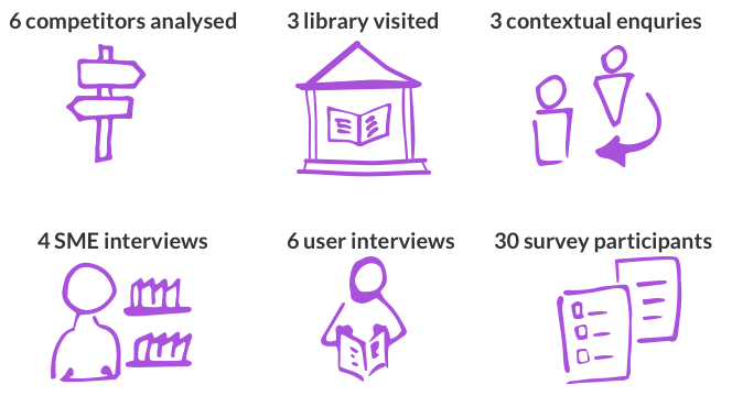
Therefore for the research phase we used a variety of research techniques.
Understanding the domain
After spending some time in different libraries, talking with SMEs and observing users, we discovered that:
The library no longer simply offers books. It has become a centre for services like hobby clubs, general advice, and workshops, where people come to socialise and connect.
Library websites display minimum information about events and activities. There are notice boards and stands in the library with leaflets and posters about what’s on.
Library prioritises activities and events based on their popularity and visitors reviews, but there is no system to accurately measure the popularity.
There is no introduction to the library resources and activities for a new visitor and no tools to keep them engaged.
“We organise a lot of events for all age groups. You can learn about them on our notice boards. But people often just come and ask us for more information, and we give them leaflets. We don’t often update the website.
-Librarian
A library website page about events and activities:
A typical notice board in the library:
Understanding the users
During our user interviews, contextual enquiries and survey results with the public, we found that
People often use the library as a workplace or a place to socialise and learn about their local community.
Visitors often struggle to find updates on events both online and on the notice boards in the library.
67% of survey respondents are more likely to visit the library if they knew what the library has to offer.
81% of survey respondents prefer attending local events.
Based on our interviews, we created a user persona of James, whose goals are common to those of our users.
James is 42 years old, married and has a 9-year-old son. He is self-employed and comes to the library regularly to work because it’s near and it’s quiet. He also values interesting community-oriented talks and getting a free professional advice during the library drop-in sessions. Every month together with his son he also attends the library book club.
Yet, James is often frustrated when he can’t find updated information about the library events he is or might be interested in: neither online nor in the library.
Typical user journey
At this moment my role was to understand the current user journey and think of how to optimise it.
I drafted a typical journey of a library visitor looking for information about the Book Club (regular library event):
Persona-based scenario
After realising how complicated the current journey is, I wanted to imagine an ideal experience from James’ perspective. So I created a persona-based scenario to focus on the library visitors and how they think and behave, rather than on technology or business goals:
It’s Sunday evening, and James is reading to his son the last chapter of the book that they were reading together. He finishes, wishes his son a good night, and walks out. Suddenly he realises he can’t remember when exactly the next library book club is.
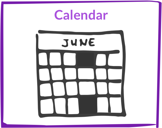
James decides to look this up on the library website. He opens it on Safari, goes to the library website and finds the section for regular activities in the library. He scrolls down until he sees the book club link and opens it. James sees the calendar planned for the next 6 months with dates, as well as the next two books the library staff decided on. He also finds out that there are currently 7 people signed up to attend the next meeting, which is great, because James and his son like having a discussion in a big group. He presses RSVP button to confirm that 2 people (he and his son) will also come. At the bottom of the page James finds an option to sign up for updates and reminders, enters his email address, and sees a confirmation pop-up window on the screen. James is exited.
On the day before the book club James receives a notification and the total number of people signed up, and looks forward to coming to the library tomorrow with his son.
Improved user journey
After that, I imagined that an improved user journey may look as straightforward as this:
I also saw an opportunity to improve an in-library experience. There were at least 2 notice boards at every library we visited. A simple re-organisation of one notice board into a clear timetable of regular activities can be helpful for visitors.
From this notice board organisation:
To this notice board organisation:
2. Framing the problem
How might we help James discover and get timely updates on the library talks and activities relevant for him, so he can use the library resources to its full potential?
3. Evolution of ideas
Early ideas
Our main idea was to clearly outline different activities a library offers, and include necessary and sufficient information about an event to help library visitors plan their visits and activities.
We each had a go with 6-8-5s creating a user flow for finding a relevant event in the library and then exchanged our sketches to critique each others work.
Getting feedback
One of the most important pages was the Event page. It seemed to We simultaneously tested three hypotheses with 3 library visitors and 2 library staff.
Hypothesis 1: Having a calendar view on the event page will help people plan their visits.
Feedback from visitors: “Knowing when is important, but I also need to know where - show me the floor plan.”
Feedback from the library staff: “We don’t usually plan further than 2 months in advance, not sure how much value the calendar can bring.”
Hypothesis 2: Social media integration will provide better awareness about what’s on.
Feedback from visitors: “It would be good to see updates from the library on twitter. Many public and government services do that today.”
Feedback from the library staff: “We never thought about it. Sounds interesting. Could try.”
Hypothesis 3: Attendance confirmation will keep visitors informed about possible changes as well as help to manage the expectations (in case of drop-in type of events).
Feedback from visitors: “Knowing how many people are coming is a good idea. I can see if I have time to ask the councillor my question this week or need to come in next week.”
“Not sure if I would always RSVP myself. Sometimes I just show up. But if with this I could get a notification about change or cancellations, I’m willing to try.”
Feedback from the library staff: “This will be great for our analytics. But how do we coordinate online and in-library sign-ups?”
Final Event page
Before: Very little explanation about the event, no way to RSVP, no particular dates, no way to share with others.
After:
Other key final pages
Events overview
Before:
List of events in no particular order.
Screenshot of a library events page
After:
Overview of events in the local borough libraries.
Homepage, introducing quick overview of the events and activities.
Sign up page
Before:
Three-step process. Step 1: choose a library in the borough. Step 2: Add your personal information. Step 3: Confirmation.
After:
We redesigned Step 1 with the purpose to know more about users preferences, so they feel valued and library has a better idea who they serve.
My Cabinet Page.
Before:
The cabinet page simply shows books and fines of the library visitor without suggesting anything to read or to attend.
After:
Introduced “Favourite events coming soon” and “Events you might like” sections to remind visitors of the library services beyond books.
4. Result for the users and the business
Design decisions
Trustworthy: Introduced “last updated on…” to reassure the users that information is accurate and up-to-date.
Conversational: Introduced feedback sections on key pages for visitors to improve communication between the library and visitors.
Grid view: Previously events were organised in a list with no consistent order. A grid view with clear sections allows for convenient navigation.
Community-oriented: Users clearly stated they prefer local events and are more likely to attend events where their friends go. We introduced social media sharing to help spread the word.
Warm welcome: Re-designed on-boarding process introduces a visitor to library activities that go beyond books and helps to keep track of those.
Reminders: Introduced 'Add to calendar' feature to ensure a desired event is not missed.
RSVP: This feature helps both the library that wants to track attendance and the visitors who want to have a sense of crowdedness for some events.
Updated navigation: The current structure has a side menu navigation with a long list of options. We conducted card sorting exercise and designed a simple top navigation.
Reflections
UX affects everything. This project was a great opportunity to see how UX means more than just interactive design. Our UX decisions were focused on improving both online and in-library experience.
Usability issues must go along with the business issues. When designing better UX, we tried to help both: for the library to build up its profile as a community hub and thus secure more funding, and for the visitors to be able to find what they need and being inspired to come again. Some features were nice to have for the users, but were not easy to implement for the library staff. We had to find the balance between what’s possible for the organisation and what’s needed for the users.
Observations are super valuable. It was really challenging to talk to people in the library as this is a place for quiet work by default. But we tried coming at different times, and it helped. When we couldn’t find someone to talk to, we just set there and observed the place and what’s going on. It really helped us to understand visitors and library interaction, and see issues we did not heard during the interviews.
Other projects
Tutti.space
Native app for creative people.
Islington council
Personalised portal to use council services.
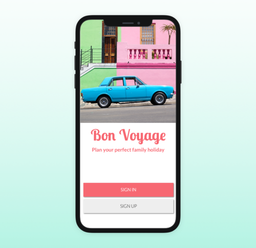
Bon Voyage
A mobile app for single parents traveling with kids.


